

Picking the right Christmas light color combinations is the single biggest design decision that separates an amateur display from a job customers will rebook every year. After installing thousands of houses and running a 43,000+ member installer community, I can tell you the same six color schemes win every time — and most of the "creative" combinations DIYers try will tank a contractor's bid before the homeowner ever sees the price.
Why Color Combinations Matter More Than Bulb Count
Homeowners decide whether to book you in the first three seconds of looking at your portfolio. Color is the dominant variable in that decision — not bulb count, not spacing, not even brand. I have watched contractors lose $2,000 jobs because their sample photos showed a roofline with five colors fighting each other. I have also watched contractors close $5,000 packages on a single photo of a clean warm-white roofline with red accents on a wreath.
The fundamentals are simple: professional displays use a limited palette, repeat that palette across architectural zones, and let the home's existing materials (brick, stone, shutter color, trim color) decide which palette wins. The biggest mistake I see in our installer community is contractors letting customers "design by request" without offering them a curated short list of proven combinations.
This guide walks you through the six combinations that consistently sell, when to use each, the architectural cues that tell you which one fits, and the bulb spec recommendations that make any of them look pro. Every recommendation here comes from real installs — not a Pinterest board.
The Six Professional Christmas Light Color Combinations
These are the six combinations our crews and the contractors in our installer community use to win 95% of jobs. Anything outside this list should be a deliberate, customer-driven exception — not your default offering.
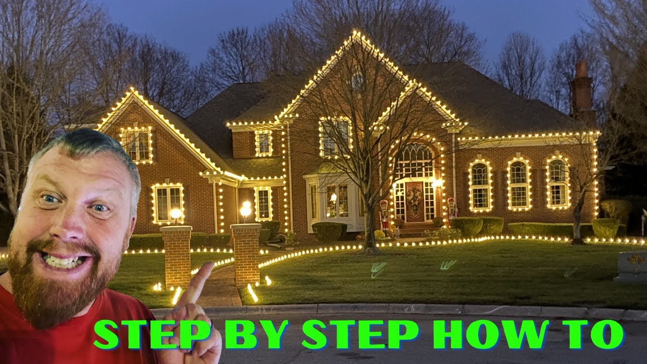
- Warm White Only — The luxury default. Reads as upscale, romantic, and timeless. Works on every home style from craftsman to modern. Pairs perfectly with brick, stone, and traditional architecture.
- Pure White (Cool White) Only — Crisp, contemporary, and clean. Best on modern homes, white trim, gray/black exteriors, and commercial properties.
- Red and Warm White — The bestseller. Classic Christmas without going cartoonish. Warm white on the roofline, red on wreaths, accent trees, or door frames.
- Multi-Color (Red/Green/Blue/Orange/Purple) — The "everyone's invited" look. Great for family homes, neighborhoods with lots of kids, and customers who want their house to be the one the neighborhood drives by.
- Red, Green, and Warm White — Traditional Christmas with a touch of class. Adds the warm white "candlelight" backdrop that keeps red and green from looking like a 1990s strip mall.
- Red and Green Only — The throwback. Looks fantastic on Victorian homes, historic districts, and customers who want unmistakable Christmas energy.
Notice what is not on this list: rainbow gradients, blue-and-white combos with no warm tones, single-color blue rooflines, or pastel anything. Those can work in narrow design contexts but they fail far more often than they succeed.
Color Combination Comparison: Which One to Recommend
| Combination | Best For Home Style | Mood | Upsell Potential |
|---|---|---|---|
| Warm White Only | Brick, stone, craftsman, traditional | Luxury, romantic, timeless | High — premium clientele |
| Pure White Only | Modern, contemporary, commercial | Crisp, clean, sophisticated | High — commercial and modern |
| Red + Warm White | Almost any home | Classic Christmas, warm | Very high — universal appeal |
| Multi-Color | Family neighborhoods, fun homes | Festive, playful, kid-friendly | Medium — competitive market |
| Red + Green + Warm White | Traditional, suburban | Traditional, balanced | High — easy to design |
| Red + Green Only | Victorian, historic, themed | Throwback, bold | Medium — niche customers |
How to Match a Color Scheme to the House
You should not be the one picking the color scheme — the house should. Walk the property and look at four signals in this order: brick or stone color, trim and shutter color, landscape (especially mature trees), and the neighborhood baseline.
- Brick or stone tone — Red brick almost always pairs best with warm white only or red + warm white. Gray stone or modern stucco usually pairs better with pure white or warm white only. Tan or buff brick can carry either palette but skews warm white.
- Trim and shutter color — Black trim handles cool/pure white beautifully. White trim is most flexible. Cream/almond trim should never get pure cool white — the mismatch makes the trim look dingy.
- Landscape — If the home has wrapped trees in the bid, those almost always look best in warm white regardless of roofline. Wrapped trees in multi-color usually clash with a multi-color roofline.
- Neighborhood baseline — If every house on the street is multi-color, suggesting warm white only will make your customer stand out. If every house is warm white, recommend warm white anyway — never be the one weird house.
One rule that saves you on every install: warm white is the safest recommendation when you are not sure. It complements every brick color, every trim color, and every customer demographic. It also commands the highest perceived price per foot.
Bulb Type and Spacing: The Spec That Makes Any Color Look Pro
You can pick the most beautiful color combination in the world and ruin it with the wrong bulb. Here is the spec that works for every combination above:
Use C9 LED bulbs on rooflines, ridges, and door frames. C9 is the larger of the two main pro sizes (compared to C7) and produces a brighter, more visible bulb from the street — which is the entire point of curb-appeal lighting. C9 vs C7 lights is a deeper read on this if you want the full comparison.
Spacing should be 12" or 15" only — never 8" or 9". Closer spacing makes the bulbs read as a solid line of light from the street instead of distinct, deliberate points. That solid-line look is amateur. Twelve-inch spacing on C9 is the most common pro spec and gives you that crisp, dotted-line appearance that makes a roofline look like it cost money. Our spacing guide and the Christmas light calculator walk through the math on this.
All C9 LED bulbs from a pro supplier should be plastic — never glass. Pair them with proper Christmas light clips (Tuff Clips for 99% of jobs) — not all-in-one clips or hot glue. The plastic Tuff bulbs we use carry a 7-year warranty and won't shatter on the roof if a strand gets dropped during install or takedown.
Designing by Zones: The Pro Way to Mix Colors
The mistake most DIYers and rookie contractors make with multi-color displays is putting every color on every zone. Then the house reads as visual noise. Pros design by zone, with each architectural element getting one or two colors that complement the others.
A simple zoning scheme that works on almost any home:
- Roofline — One color only (warm white most commonly). This is your "frame."
- Wrapped trees — Match the roofline color or one shade warmer/cooler. Warm white wrapped trees with a warm white roofline is the most popular pro look.
- Wreaths and door frames — This is where you add a pop. Red on a warm white house. Red bow on a multi-color house.
- Bushes and shrubs — Match the roofline or use a single accent color (red and warm white mini lights at 4" or 6" spacing on shrubs is a beautiful pop).
- Pathway / stake lighting — Warm white almost always, regardless of what the roof is doing.
The principle: each zone has a job. The roofline frames the house. The trees fill the yard. The wreath draws the eye to the front door. Don't let your colors fight each other across zones.
For bushes, the rule we drill into our crews is no net lights — net lights look cheap on camera and from the street. Use mini light strings with 4" or 6" spacing wrapped properly. Our bush lighting calculator tells you exactly how many strands per bush.
Color Temperature: Warm White Is Not Just "White"
Here is where most contractors get tripped up. When a customer says "white lights," they almost never mean cool white. They mean warm white. The two look completely different on a house:
Christmas light "white" is defined by the Kelvin scale, and the Kelvin value is what determines whether a roofline reads warm and inviting or cold and clinical. Warm white measures around 2700K–3000K on the Kelvin scale. It glows yellow-orange like an old incandescent bulb or candlelight. Reads as romantic, traditional, and high-end.
Pure white (cool white) measures around 5000K–6500K. It is crisp and slightly blue. Reads as modern, sterile, or "commercial." On a traditional home with red brick, cool white looks wrong almost every time — too clinical. On a modern home with gray siding and black trim, cool white looks intentional and sharp.
If you only stock one shade of white, stock warm white. Always confirm with the customer which "white" they mean before you order — and if they are unsure, show them photos of both on similar homes. For the full breakdown on how the Kelvin scale affects how your Christmas lights read from the street — and which Kelvin range each professional combination calls for — read our complete Christmas light color temperature guide.
Color Combinations That Look Cheap (And Why)
These are the schemes I tell every contractor in our community to avoid unless the customer absolutely insists — and even then, get it in writing that they requested it:
- Blue and white — Reads as Hanukkah, "winter wonderland," or unintentionally somber. Works only on very specific modern or themed homes. Most homeowners hate it the first time it's on the house.
- Single-color blue roofline — Hits the same problem. Blue alone on a roof rarely says "Christmas."
- Pastel colors — Pink, light green, lavender. These look fine on a tabletop tree. On a 100-foot roofline they look washed out from the street.
- Rainbow alternating bulbs (every-other-bulb pattern) — Up close it's charming. From 50 feet away it looks pixelated and busy.
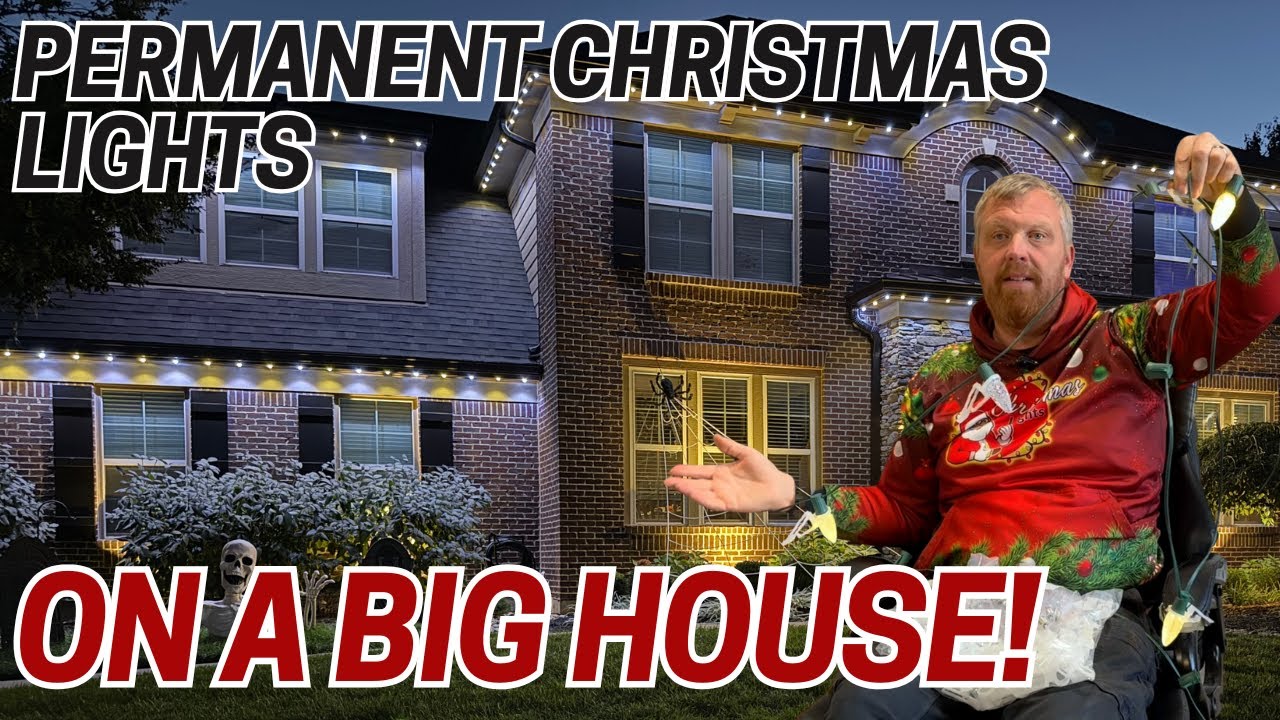
- Mixing warm white and cool white on the same roofline — This is the single most common amateur mistake. The two whites look like a strand of failing lights to anyone driving by.
- Mini lights on SPT wire on rooflines or door frames — Even with the right color, mini lights on the roofline scream "DIY." Use C9 or C7 only. Mini lights belong on bushes, trees, and wreaths.
If a customer requests one of these, your job is to show them a side-by-side photo of their requested combination versus warm white only or red + warm white. Nine times out of ten they upgrade themselves.
Selling the Color Combination as the Upsell
The color choice is one of the easiest places to upsell because it's purely an aesthetic decision — there's no extra labor in stocking warm white vs. multi-color, but warm white commands a premium price perception. Position it in your sales conversation like this:
Tier 1 (entry): Multi-color or red/green — playful, festive, "neighborhood favorite" pricing at $8/ft.
Tier 2 (mid): Red + warm white — classic, balanced, "the look most people pick" at $10/ft.
Tier 3 (premium): Warm white only with red wreath/door accents — "luxury, timeless, looks like the magazine cover" at $12/ft.
The pricing isn't really about cost — it's about positioning. Premium customers want to be told what premium looks like. Most contractors selling at these tiers buy pre-built professional Christmas light kits in bulk so they can color-match across jobs without burning install time on parts hunts. For more on package pricing strategy, see our professional packages guide and the deeper bidding breakdown.
One more pro move: build a portfolio of one home in each color combination and show only those six photos. Customers who can pick from six clear options buy faster than customers staring at a Pinterest board of 50 inconsistent installs. And the cleaner your portfolio looks, the higher the perceived ticket — easily pushing your average from $1,000 toward the $1,500–$2,000 sweet spot.
Permanent Lighting and Color Flexibility
If your customer wants the freedom to change color schemes year-round — Halloween orange, Valentine's red, July 4th red/white/blue — permanent lighting is the upsell. Permanent lighting systems use RGB+W bulbs that can hit every color on this guide (and a few hundred more) via app control. That solves the customer who can't decide between warm white and multi-color: now they have both, plus every holiday in between.
Permanent lighting is also the highest-margin product in our industry. A 200-foot install can run $14,000+ on a single house. If you're not offering it yet, our permanent lighting starter guide and the permanent lighting pricing guide are where to start.
Related Guides
- Christmas Light Color Temperature: Complete Kelvin Scale Guide for Pros
- C9 vs C7 Christmas Lights: Which Should You Use?
- C9 LED Christmas Lights: The Complete Contractor's Guide
- How Many Christmas Lights Per Foot? Spacing Guide
- Professional Christmas Light Packages: What Every Contractor Needs
- How to Bid Christmas Light Jobs
- Best Christmas Lights for Outside
- How to Add Permanent Lighting to Your Business
Frequently Asked Questions
What is the most popular Christmas light color combination for professional installs?
Warm white only and red + warm white are the two most-requested combinations in our 43,000+ member installer community. Warm white alone commands the highest perceived ticket price ($12/ft+ in most markets), while red + warm white has the broadest demographic appeal. Both look great on virtually every home style.
Can you mix warm white and cool white on the same house?
Not on the same zone. Mixing warm white and cool white on a single roofline reads as failing or mismatched bulbs from the street. You can pair them across zones (e.g., cool white roofline with warm white wrapped trees) on modern homes, but the safer pro move is to pick one shade of white and commit to it across the whole property.
What color Christmas lights look best on red brick?
Warm white only or red + warm white look best on red brick homes. The warm tone complements the brick's natural color and avoids the clinical clash you get with cool white. Pure cool white on red brick almost always looks "off" and can make the brick read as pink under the light.
Is multi-color or single-color Christmas lighting more profitable for contractors?
Single-color (warm white or pure white) installs typically carry 15-25% higher per-foot pricing than multi-color because they're perceived as more upscale. However, multi-color packages close faster with family-home customers, so the per-job revenue can be similar. The highest-margin play is positioning warm white as your premium tier at $12/ft+.
What bulb spacing works best for color combinations?
Use 12" or 15" spacing on C9 LED bulbs for any color combination. Closer spacing (8" or 9") makes the bulbs blur together into a solid line of light, which looks amateur and washes out the color distinction. Twelve-inch C9 spacing is the pro standard and lets each bulb's color read clearly from the street.